

Bridging Regulatory and User Needs
Background
A financial services company commissioned work to optimise a credit card application form shaped by extensive legal and regulatory requirements. The challenge was not to reduce compliance, but to translate mandatory information and steps into a process that users could understand, navigate, and recover from errors without friction.
My role was to bridge regulatory intent and user needs by making a complex, rule-bound process clearer and to optimise the usability of the form.
Approach
I created a series of wireframes for both desktop and mobile, optimising the journeys and aligning the wireframes with the business requirements.
Using best practice usability, each screen of the existing form was analysed and optimised, with the objective of
-
Removing any ambiguity around eligibility tests versus the application itself
-
Reducing large tracts of text (via infographics, accordion links etc, where appropriate)
-
Inspecting labels, copy and error messages
-
Evaluating and improving the current journeys
Research Objectives
The objectives of the research were to assess, through prototype testing, whether:
-
Participants could understand the overall site structure and navigation
-
The credit card application form was easy to locate, understand, and progress through
-
Users could recognise and recover from errors during completion
Customer Experience Empathy Strips
A series of customer experience empathy strips were created to help the business understand common user experience issues within this type of application process.

Setting expectations

Reducing effort

Removing extraneous
Customer Journeys
Customer journeys were scoped out prior to creating wireframes, which would become the blueprint for the prototype screens.

Wireframes
A series of annotated wireframes for both desktop and mobile were developed closely with the client, to ensure that any legal steps were included, and discussions were had around where compromises could be made.

Prototypes for Testing
Once the wireframes were iterated and approved with the client, I created fully interactive prototypes and conducted testing with research participants.
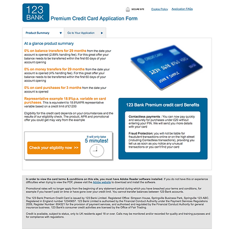
The prototypes were given an anonymous branding.

Outcome
Following the research, participants reported that :
-
The structure and navigation of the prototype were easy to understand, and the application form was straightforward to locate
-
The length and number of fields in the form met expectations for a credit card application and did not feel excessive
-
Most fields were perceived as necessary, and the form compared favourably to similar online application processes
-
Users expected to spend up to 30 minutes completing the form, although efficiency was valued
-
When mistakes were made, users were generally able to identify and correct them without abandoning the form
The findings provided confidence in the overall structure and usability of the form, while highlighting targeted areas for refinement before further rollout.